Whilst Shape Architecture employ all types of design methodologies in designing a building, it is the section cutting through a structure that is favoured and used from the earliest design sketch onwards. Designing in this way allows us to explore the integration and the relationship of different levels of a building and most importantly how natural light can be brought into the interior. Equally we are able to explore how someone would move between levels and the views and glimpses they would be afforded as they move around the space.
Following the drawing of freehand sections a series of sectional perspectives cut through a 3D computer model will be worked upon. These images will show light and shadow and help to further explore design decisions and potential. Furniture and a general sense of scale can be explored and most importantly, communicated clearly with the client.
Often these computer visualisations are mixed with other methods of graphical representation to further enhance the quality of the image and the design.
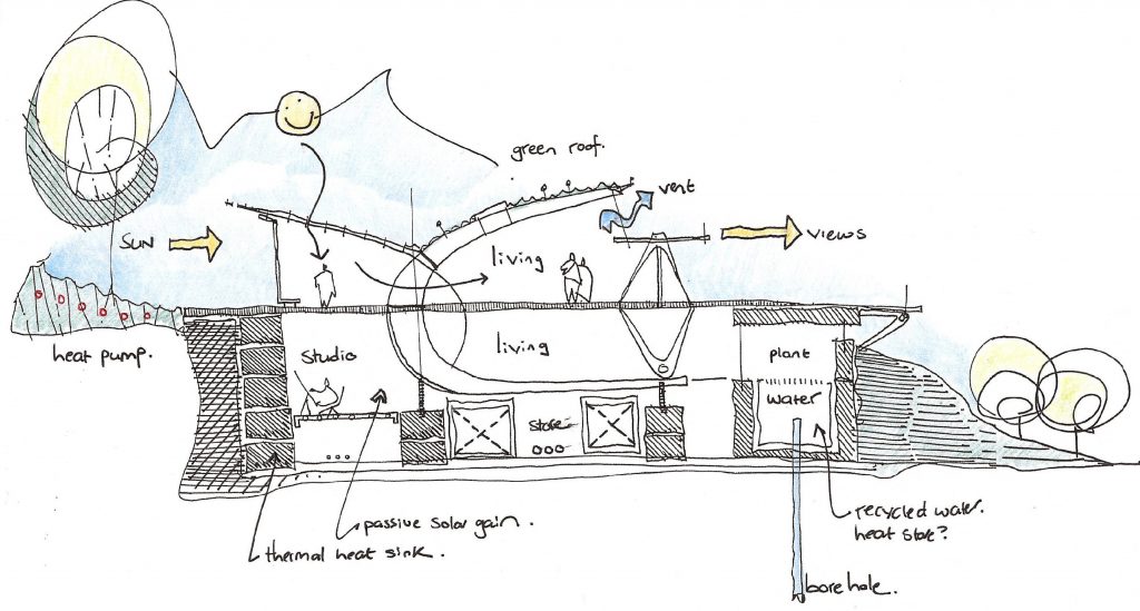
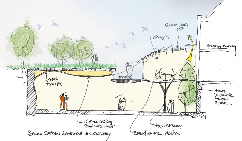
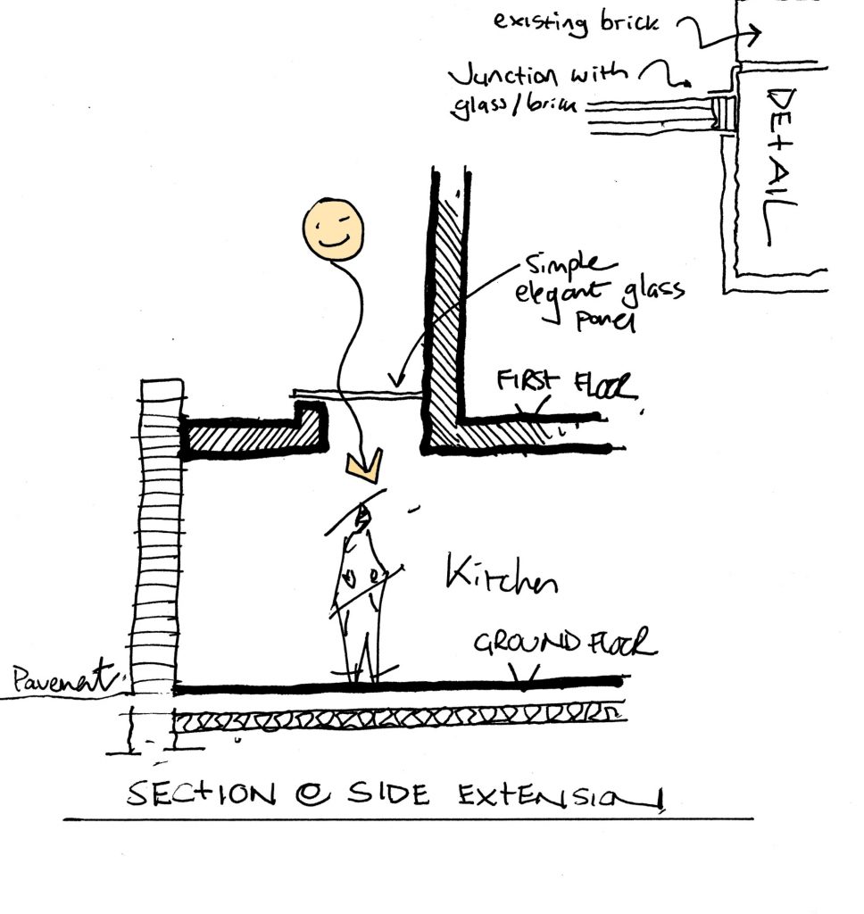
Below are several examples of projects where the drawing of sections have had a large impact on the quality of the architecture. These range from a proposed house in the Dartmoor National Park, to a glazed entrance to a Fulham basement project and a below garden extension to a Grade 2 listed house opposite the long walk in Windsor.

The house in Dartmoor house envisaged a structure built towards the top of a hilly site backing onto a tree lined ridge and in its use of materials it would deploy stone and timber which are the typical local building materials in an original and striking form. The section allowed the building to be designed such that there was compete clarity between all elements of the structure. A series of timber large timber hoops faced one direction with smaller hoops the other and the elliptical overlap formed the central circulation spine. The hoops were clearly set of a the subterranean floor level on a series of posts and this level was lined with stone – all to evoke a feeling of an archaeological dig that could be walked around and explored.

The below garden section to the grade 2 listed property in Windsor was linked to the main building by a glass orangery. The floorplate within this was designed as freestanding lift supported by a sculptural steel tree. The curved lines of the glass roof were resolved into the waved ceiling of the below garden room in the form of curved birch faced ply. The cross section was key in integrating these forms and understanding the potential of views between all spaces. It was this is clarity of design that helped the project to achieve listed building consent.

All projects benefit from being drawn in section and this Fulham basement extension has a clear feature that helps integrate new basement extension with the house and garden in the form of a glass cube projecting into the garden into which the staircase was set. One of the key design images took both 2D and 3D representation to form the key image for this element.
We hope that we have shown how drawing and in particular drawing in section is the foundation of good design and architecture.


