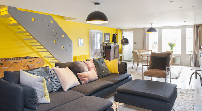
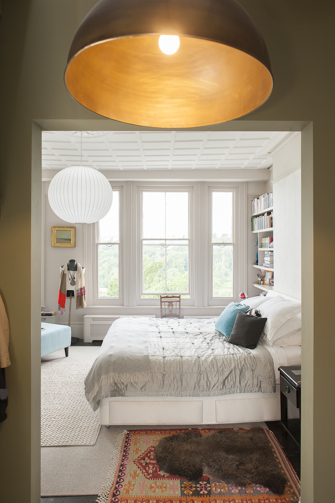
Our project in Hastings overlooking the Old Town and the sea is an important project for our practice. It began in Hove where our clients contacted Shape Architecture to visit a number of properties with them in and around Hove as they looked to move. We had a lovely afternoon exploring flats and houses in Hove, but a move at that time did not work out. Nonetheless, both parties enjoyed themselves and a year later we were contacted again by our Clients to say that they had moved and had bought a large property in Hastings, and would we like to visit with a view to working with them. The Hastings house in High Wyckham road was well located and had a great deal of potential. It was initially configured as two separate flats, included a large and dark internal courtyard and had a series of poor quality structures to the rear, out of which a large family home should be made. We were excited and very happy to be selected for the project and started works straight away.
Survey and Concepts
Architects from our office visited site and undertook the dimensional survey in order that a measured survey could be drawn up which included floor plans, sections and elevations. It was a challenging survey due to the complexity of the existing structure. The drawings were produced alongside a 3D computer model which would be developed as the project progressed. At the request of the Client we also made a physical card model that could be taken apart and this would be used to explain the project to various neighbours and friends.
Concepts
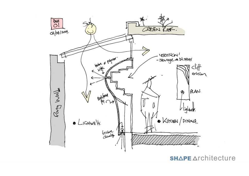
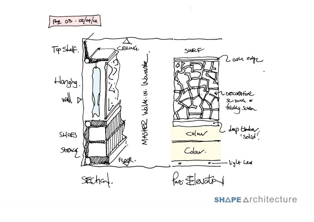
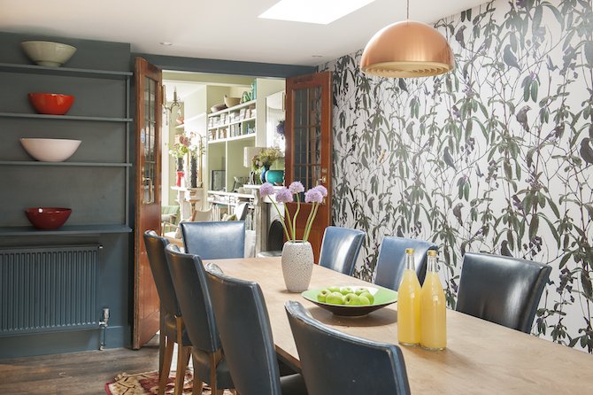
Our brief was clear in terms of the arrangement of rooms and included a master bedroom suite, music room and the ability to use the lower ground floor as a separate flat when required. It was clear that the property both at lower ground and ground floor levels should extend into the lightwell to add additional floor space, improve the flow of spaces and to remove what was a negative feature of the present building. A significant challenge was the bringing of natural light into the lower ground floor. The street side had a bay window but the floor plan became progressively darker towards the rear. We proposed creating a long narrow light shaft that would terminate in a series of rooflights set within the extension of the roof. The impact of natural light and natural ventilation would be dramatic. It also started to suggest the new roof that was much overlooked would be of interest. We then decided to form it as a green sedum roof, of which we had undertaken many, and put another rooflight which would light the dining table in the ground floor kitchen.
Planning Permission
As mentioned, the rear of the property was in a poor state and the re-design included the simplification and reworking of the rear and side facade. The property is in a prominent Conservation Area. Planning approval was duly granted at the first attempt and work began on the detailed and technical development of the project.
Detailed and Technical Design
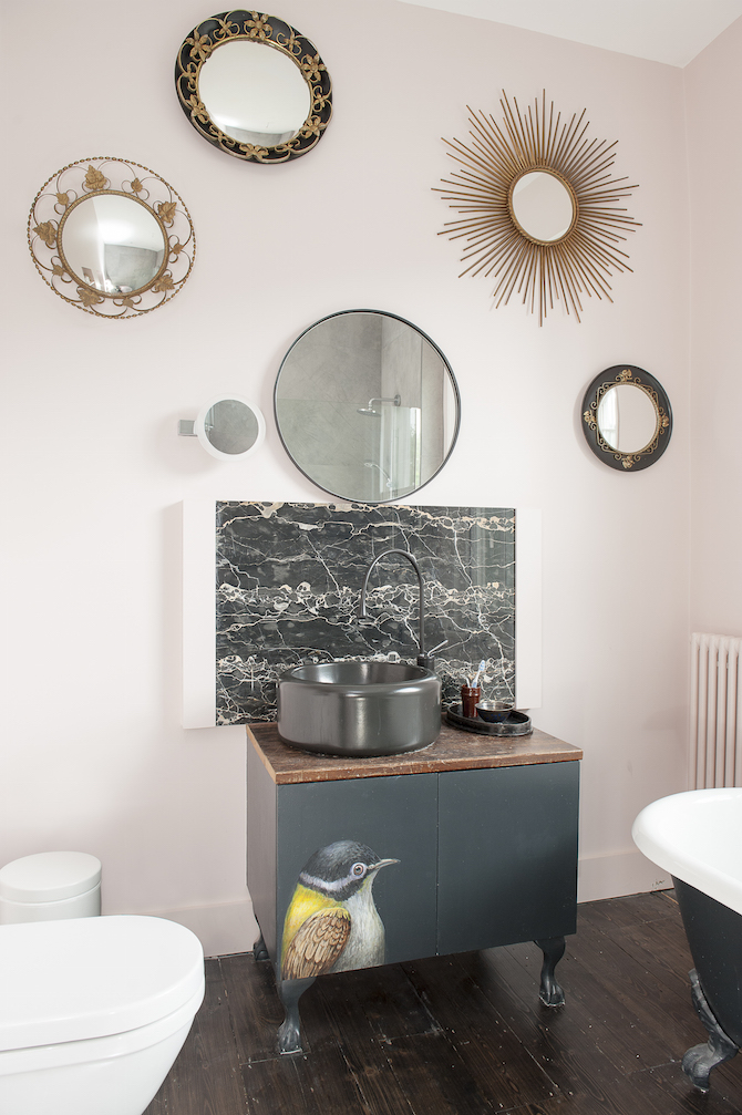
This period of works was very enjoyable. Our Client had a great interest in the project with clear ideas and the process felt like a true creative collaboration. One avenue we followed was the re-use and upcycling of objects and materials. Shape Architecture has created two Eco Sheds in Hammersmith which followed the re-use of materials in a similar way for a Community client and it would be very interesting to apply this in a residential setting. Our Client suggested a visit to Retrouvious on the Old Harrow Road in London. It was a very useful and inspiring visit and also included finding beautiful tiles by Emrie Cie which we utilized throughout the bathrooms and kitchens. Equally our Client also worked with CP Hart for bathrooms fixtures and fittings and Farrow and Ball for colour advice. Shape Architecture prepared a tender pack describing all these works and also included the structural engineer’s drawings and went out to Tender.
Project on Site
With Building Regulations submitted and a Contractor selected works commenced on site. A challenge involved the demolition and then structural works around the existing courtyard which was carried out very well by the builder. As a project on site it was certainly one where there was a constant unveiling of views, glimpses and spaces to the pleasure of all involved. The sedum roof and rooflight combination worked very well. The light shaft into the lower ground floor, particularly standing underneath it and looking up at the sky, is very impressive. The kitchen and dining room and its connection with the garden and also the reception room works so very well. Small bathrooms, WC’s and En-suites are all well-formed.
Completion
I think everyone saw the potential of this project and its challenges. It is the product of hard work, vision and collaboration and one we are very proud of and more importantly it is loved by our Clients. We have many good photographs of the house taken for an article in the Wealden Times.
Conclusion
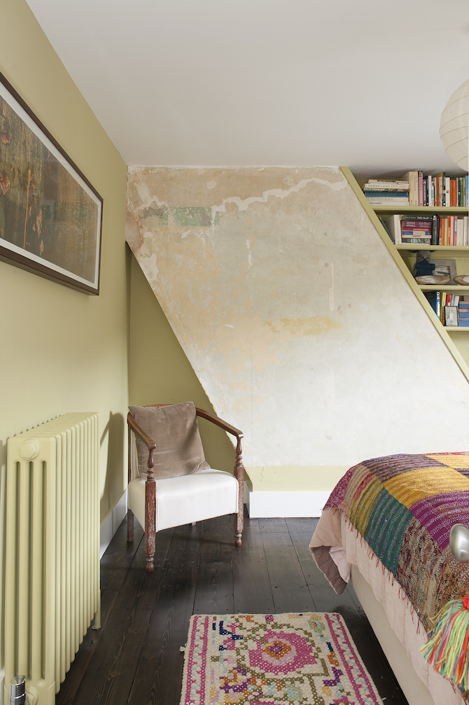
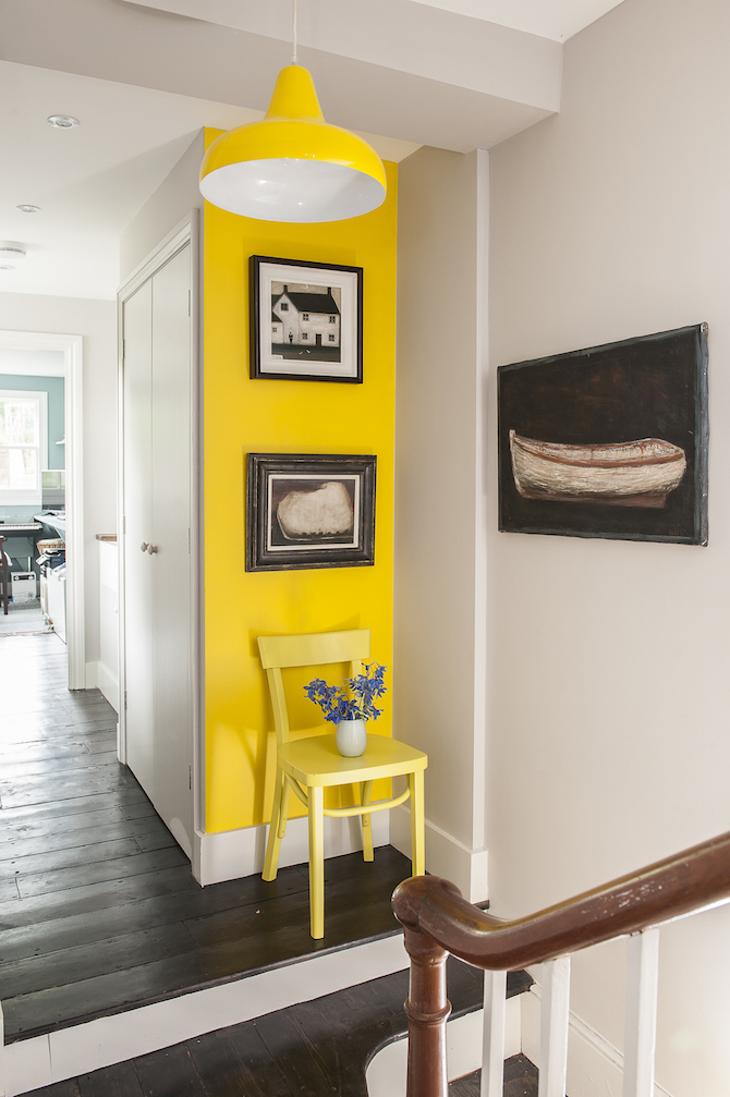
Looking back I am struck by how such a complex and rundown building can be simplified and beautified to create something magical. The use of colour and pattern throughout is striking and holds together as a composition. Our Client asked an artist friend to paint a series of birds flying through the house and out to the sky. It is a home with a big heart.
Our Client says:
‘ Jason Wren was our architect on a complete renewal – every floor was transformed – and side extension of our Victorian house above the Old Town, Hastings, in a much-loved conservation area street, with several Grade 11-listed houses. He was the Hero of the Hour. As with most long builds, we had our challenges and setbacks and Jason was always there for us, completely supportive and a tower of calm strength and forbearance. Every awkward turn seemed to present him with an opportunity for an imaginative resolution – in fact, I wondered if he rather relished those! He is brilliant at explaining spatial matters and is never condescending for those of us who find plans on paper hard to ‘read’. He can do exquisite good taste in high-end properties, but he also loves the opportunity to be more funky and cool. He is as engaged in the interior finishes and details – he has great ideas here – as the bigger picture.
After working with him over a year or more, I feel lucky to have been his client but also would like to consider him a friend.”


